
Curious runners/coaches/parents have been piling on the questions lately, one of which has been on repeat, how are these dang numbers calculated?
I’m putting regional previews on hold for a few days (26 is next) to go over my process.
First, a little background:
What are speed ratings?
Speed ratings are derived from horse racing. In the 1970’s, Beyer Speed Figures were created to compare horses across the country. Horse racing has some similarities to cross country. Horses race in varying weather, track surfaces, and race distances. Cross country runners race in varying weather and surfaces, but also not every course is measured exactly to 5 kilometers. There might be wheel slippage, there might be rounded turns, there might be a missing cone here or there.
In essence, speed ratings are a figure to see how fast an athlete ran on that course on that day. Then they are used to compare against other runners on other courses/other days.
When can we use speed ratings?
They can be used year-round. During the season, an athlete can judge themselves week to week. They can judge how they compare against other athletes. A coach can look to see if there’s week to week improvement, or in the off-season, take a second look at how an athlete responded to training. College coaches can hopefully use these in accordance with track times to find recruits that wouldn’t normally be on one’s radar.
Where can we use speed ratings?
Preferably in your free time. Don’t browse this site at school.
How are speed ratings calculated?
It’s all about that baseline.
For last year, I used MIS. This year, I’m working to find a meet (or more, will expand on that later) that will work as a baseline. The baseline determines the differential between races.
One of my projects this summer is to find meets that will make a good baseline. One of them that’s looking like a contender (on the boys side) is Bath. Why Bath? It’s second week in September, so many meets are within a few weeks time. Of the 734 boys finishers, 132 ran at MIS, and the average difference in rating between those 132 was 0.6 rating points. It was an accurate predictor of how athletes ran at the end of the year and it’s one of the higher sample sizes you’ll find.
When you list all the race times (in seconds) from Bath, you come up with this graph:
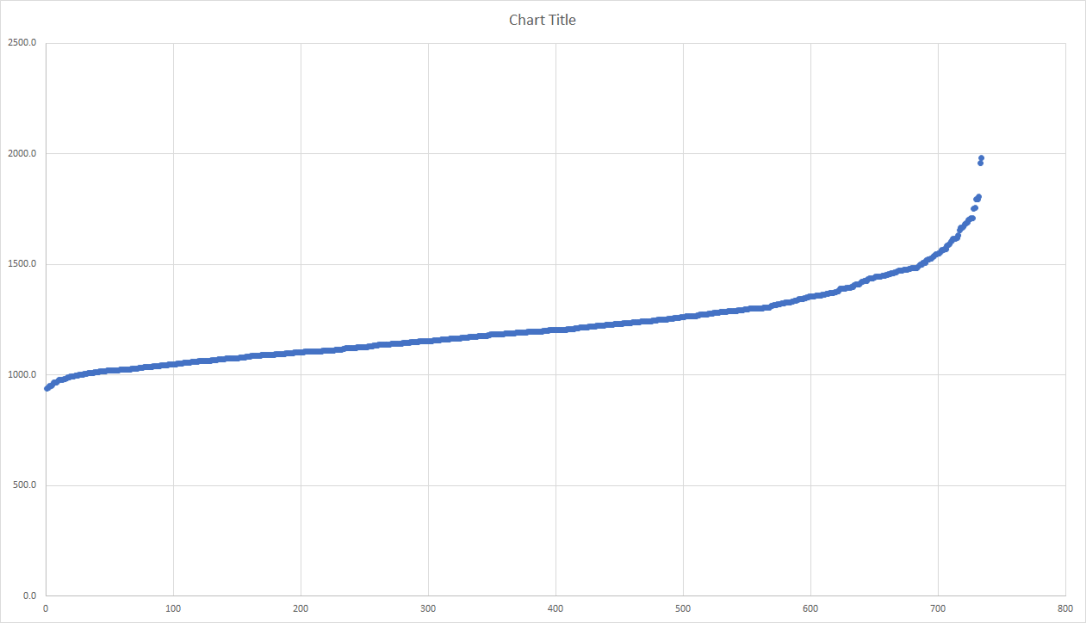
Seconds are listed on the y-axis, faster times are on the left, slower on the right. In meets, especially those with a larger sample, you’ll get a curve of a similar shape. The straight line in the middle are your “average” runners (in this case running between 17:30 and 20:00). Using that straight line, we determine the best fit using our eyes, and find the y-intercept of that line.
On this graph, I’ve determined that to be 1004 seconds.
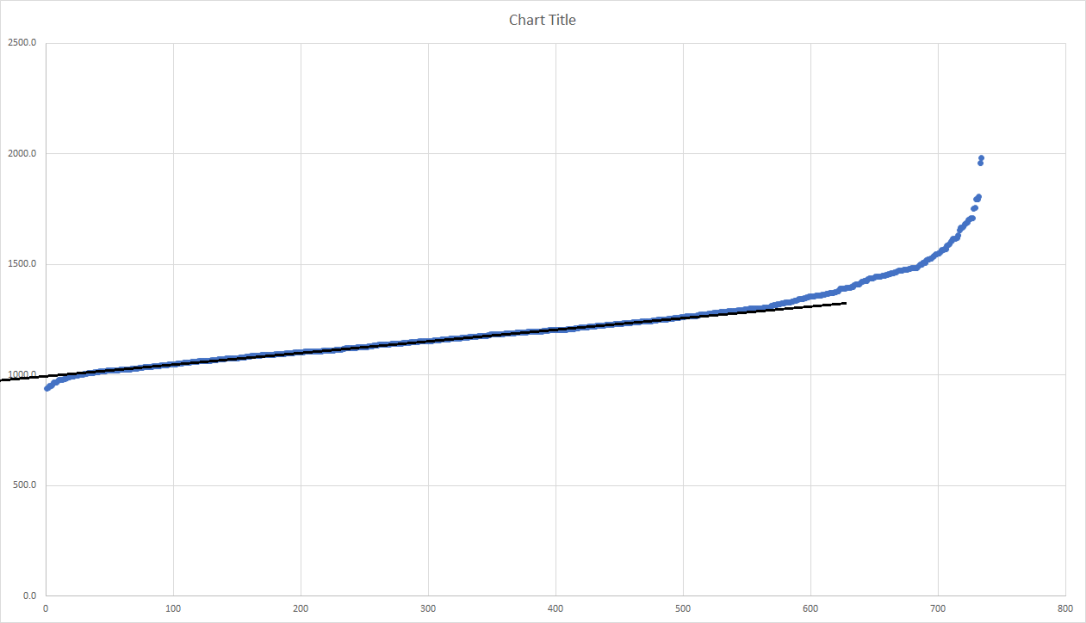
Ann Arbor Running Company’s Early Bird is a meet a few weeks prior with a similar amount of runners. Here’s the graph from that race:
I’ve determined the y-intercept to be at 1013 seconds. The baseline of Bath was 1004 seconds, so A2EB (2018) is 9 seconds slower than Bath (2018). For last year’s ratings, I had Bath as being 12 seconds slower than a typical, non-muddy MIS. So if Bath is used as a baseline, the differential between A2EB and MIS (on a normal day where they cut the grass) would be 21 seconds.
All that is great, what do the actual numbers mean?
Nick Foster ran 15:17.9 at A2EB. The formula being used is:
((1560 – (time in seconds – course differential))/3
(1560 – (917.9 – 21))/3 = 221.0
Eventually, I’ll figure out how to put a calculator that converts ratings to potential State Meet race times, but as for now, use this chart:
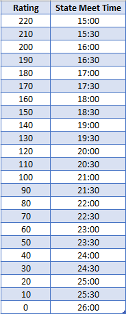
Each rating point is worth 3 seconds. Those 132 runners that ran at Bath and States, they were 0.6 rating points, or 1.8 seconds apart.
What are you working on this summer?
My primary goal is to get people talking about cross country year round. To get kids to realize their potential or to prove my projections wrong, that they’ll outperform what my previews state. To lighten the load on coaches as well as they scout those in their region. And maybe, if these previews are accurate, find a way to get in that room where they select regions.
Behind the scenes, I’m trying to find the best baselines. Bath is a great start, but there are plenty of meets with less participants and a slower average field. I can’t just rate the big meets. I’m looking to find invitationals that have less runners and a variation of strength within those runners. ‘
I cannot predict how the differentials will turn out, but I can give a good guess based on an initial look at the times. Two of the factors I’m looking at are the amount of “average runners” in relation to the size of the field and the average strength of the field. If I can compare meets that have similar ratios of average runners or similar abilities, that will hopefully be more accurate than potentially comparing the OAA Red vs. the Ski Valley Conference. Field size is a factor as well.
Before the season begins, I’ll report back on which baselines will be used. They’ll all be from the 2018 season.
YOUR PROJECTIONS HAVE ME TOO LOW
That’s fine, they’re just projections. I cannot predict how much work you’ll put in. I cannot change what you ran last year. There are so many factors that go into a change in times from early November to early August. I cannot list them all or even begin to try. Luckily, the projections WILL NOT MATTER when the season (it can’t come soon enough) begins.
Last winter, I looked into the average improvement made by each runner that competed in both 2017 and 2018. I expected to see a pretty graph that showed slower runners improving a slightly higher rate than faster runners, freshmen improving at a higher rate than juniors. Instead, it was all a bunch of noise. Many improvements high and low, some downfalls, all in all highly variant.
That stunk, so the backup plan was to place runners into segments. For example, 9th grade boys that were rated between 180-185 improved by 6.1 rating points. So if you’re a Max Sharnas and were rated 181.4 as a freshman, your projected rating is 187.5
But that’s not all! Track has to play a role. Track times have a correlation with XC success. By comparing track times with XC ratings the past two years, I came up with some rough formulas that attempt to equate those track times to ratings. For the 3200m, that was 490 – (time in seconds/2).
Let’s take Adam Jesse’s 9:29.73, that equates to a 205.1. His projected improvement only had him at 201.8. Is he a 205.1 or 201.8? They’re both distance running, but a 5k is a different beast and we’re not rating for track courses, so XC gets a larger weight. He ended up at 203.1. It might not seem like much, only 10 seconds between those two spots, but I have 10 runners occupying those 10 seconds.
Hope this explains the numbers and calculations!

4 thoughts on “How are Speed Ratings Calculated?”